HSVPOA BOARD BRIEF #31 – May 18, 2023
BOARD REVIEWS NEW LOGO DESIGN
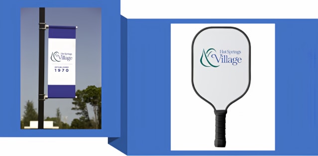
“At this week’s HSVPOA Board of Directors meeting the new Hot Springs Village logo was shared with Board members and guests in the audience. The new logo recognizes our 50-year-old heritage as well as offering a focus on an energized, stable future. The logo, simple but strong (see below), combines a stylized likeness of a conquistador helmet (past heritage) with a modern rendition of the words “Hot Springs Village.” There is also a version of the logo intended for internal use on merchandise and signage, with “HSV” replacing the full name of our community.
“The Board approved of the color palette, intended to represent the features of our Village – a dark blue representing the water in our lakes, a lighter blue representing the clear blue sky, a deep green representing our forests and our golf courses, a gold representative of the sun that we are so fortunate to enjoy so many days of the year, and a light tan representative of our beaches and the golf course bunkers.
“The Board gave unanimous approval for the new logo, which will be phased in over time, as materials and merchandise with the current logo are used up. The goal of the phased-in approach is to minimize expenses typically associated with the transition from one logo to another.”
Respectfully provided,
HSVPOA Board of Directors
May 18, 2023


Spend our money on “necessary” infrastructure.
I love the new design, the old logo was drab and dingy looking. The new logo is bright with clean lines, modern, and represents the positive future of Hot Springs Village. Kudos to HSV marketing team for this design!
The new logo shows respect for our heritage while at the same time giving us a fresh, new look suitable for far into the future. It is a logo that doesn’t ignore the past but also looks to a bright new beginning, which is our path. Previously, we were rebranded with something entirely different than the original conquistador. Some people don’t realize we are much closer to our roots with the new logo than with the one we have used for several years. General Manager Kelly Hale and the Board are giving a genial nod to our proud heritage with this logo while at the same time offering a warmhearted embrace of our future. The most recent logo did not do that. In addition, the cost will be minimal as this design is gently phased in using strategic and economical deployment methods.
I prefer the original logo. I’ve been coming to the Village since
1979 and loved the logo. So sorry to see it go and be replaced
with a logo that means nothing. Badly spent money.
Agree. So much for Hale not wasting money. This $25k consultant fee could have been spent on pot holes. We need a leadership change if this is what they spend our precious resources on. Shameful.
Rod Manga, why do you think there was a $25,000 consultant fee? Where are you getting this number? Pulling it out of your hat? Kelly Hale has done a lot of good for this community and you want to fire him because you don’t like the logo? A bit harsh, it seems. Are we really this petty as a community? I hope not.
It is really Fugly. It is a shame they didn’t consult the residents before making a choice. Another irresponsible waste of our money.
Timothy, I am sorry you are unhappy with the logo. This is not the type of thing that residents vote on and if we voted on every issue like this, all of our money would be spent conducting elections. This logo will be phased in gradually, so it will not have a big impact on our finances. We can second guess and complain about every little thing the POA does or we can get on board and help turn this village around in the right direction. I watch very closely and I do see things moving in the right direction and it has been a long time coming. Having said that, I do respect your right to have your own opinion. Thank you.