Enough With The Logo Drama!
From Pam Avila, HSVPOA Communications/Revenue Generation Specialist
In response to the Village Voice Letters to the Editor from 3 Village residents plus numerous comments on social media, there seems to be some significant confusion about the new Hot Springs Village logo. First and foremost, the POA in general and the GM in particular need no “authorization” to redo the HSV logo, which falls under the responsibilities of POA communications/marketing. Let’s be clear about the purpose of our logo (or any logo). To clarify – the purpose of a logo is not to please the business (the POA) or existing customers (Village residents). A logo is a strategic business tool that allows an organization (Hot Springs Village) to be identified in the vast world we live in, specifically beyond our gates. Said in different words, a logo is a strategy – not an art form.
The new HSV logo did not happen quickly. It began with acknowledgment that the current logo was neither unique nor memorable and had no “historical relevance.” Creating a new logo was the culmination of a multi-part process that looked at what is special about the Village; understanding its past and its future; then an exploration of colors, font styles and other logo representations; and finally a number of possible logos created by a professional team of marketing designers. The possibilities were narrowed down by HSV marketing staff, members of the Communications/Marketing Committee, and POA staff who had some marketing experience.
As is customary in business or even in government, the logo was not put up for a vote of residents because, as already stated, it is a marketing tool that should not be subject to the whims and fancies of non-professionals. The purpose of the logo is not to satisfy existing “customers” (current residents) but to attract new customers (new residents).
The POA is proud of the new logo that acknowledges our past 50 years of existence with a stylized conquistador helmet and speaks to the next 50 years with a more updated look that reflects the colors of the environment we call home.
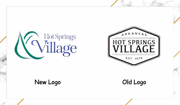
This is the old logo….. what is the historical significance here?

This is the new logo honoring our traditions via a stylized helmet while acknowledging our future with more modern colors and writing (fonts).


